Logo Design + Visual Branding + Product Photography + Website Design
RediFlame® approached us to overhaul their website, but it became clear early in the process that their logo and visual branding needed some refreshing too. The logo was refreshed by reducing the layered look of the logo and the flame was completely replaced with a simple design that is more responsive at any size so it could be part of the visual branding elements. The client’s logo kit consists of two variations; grunge/texture and a solid logo design. Their visual branding included a primary and a secondary color palette.
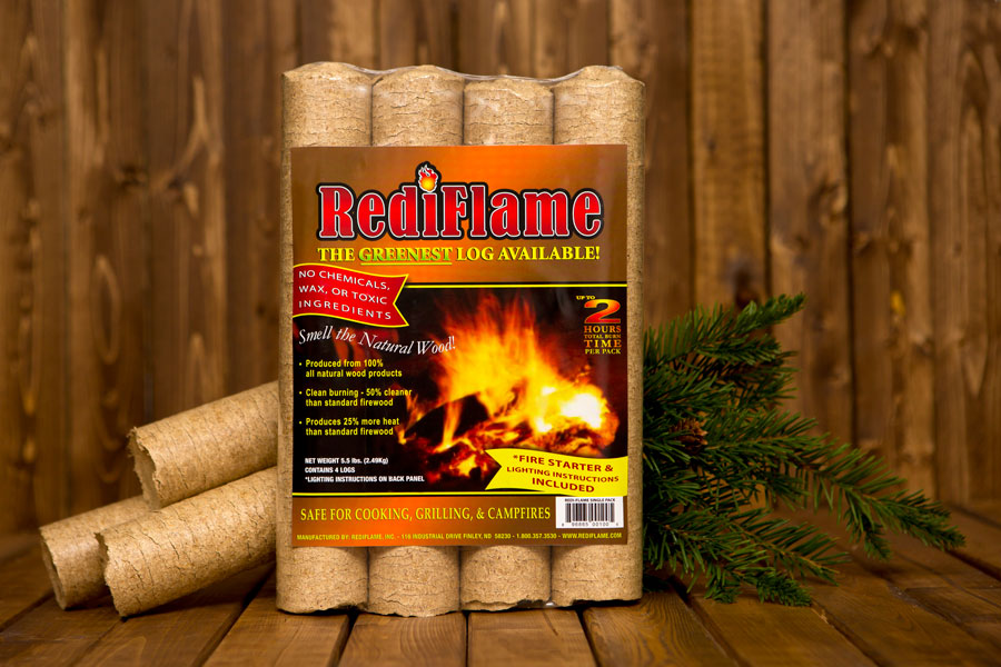
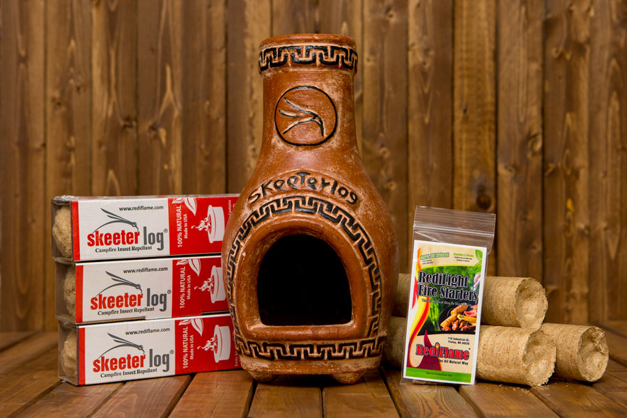
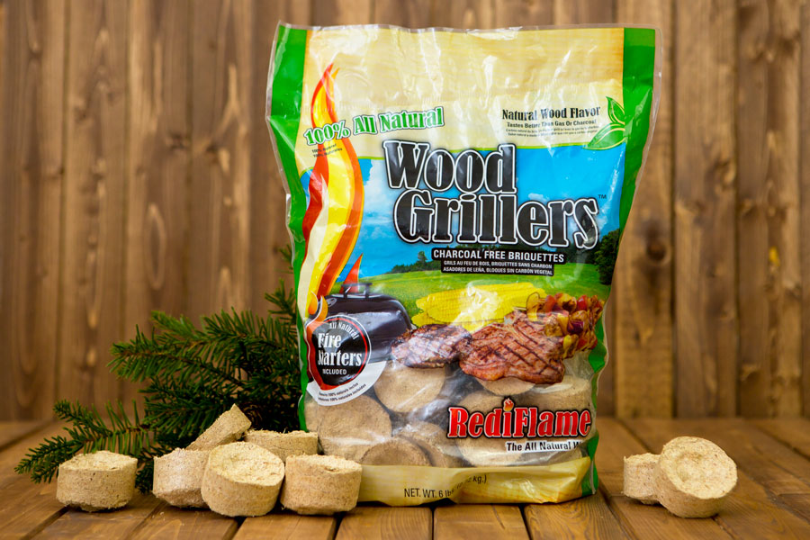
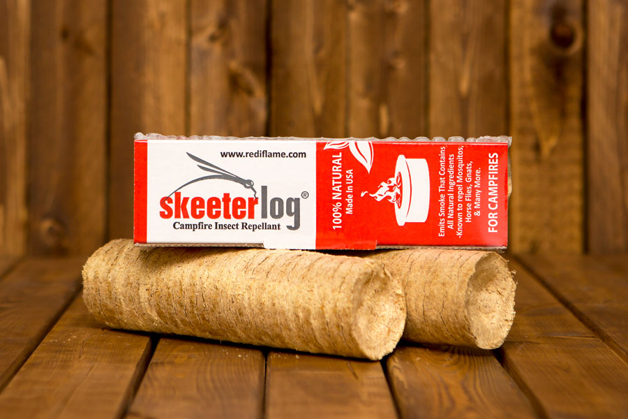
Before work could begin on the website we needed to make RediFlame’s products look good + stand out by having a product photo shoot session to highlight all of RediFlame’s products. The products were captured on a wood background with various product group shots and also photoshopped to have a transparent/white background option. Once the product images were ready it was time to created a beautiful mobile-responsive website for RediFlame. The website is easy to navigate, has strong call-to-actions, and showcases their products very well; with a cool where to buy tool.

