Logo Design + Visual Branding + Print Materials + Website Design + Product Photography
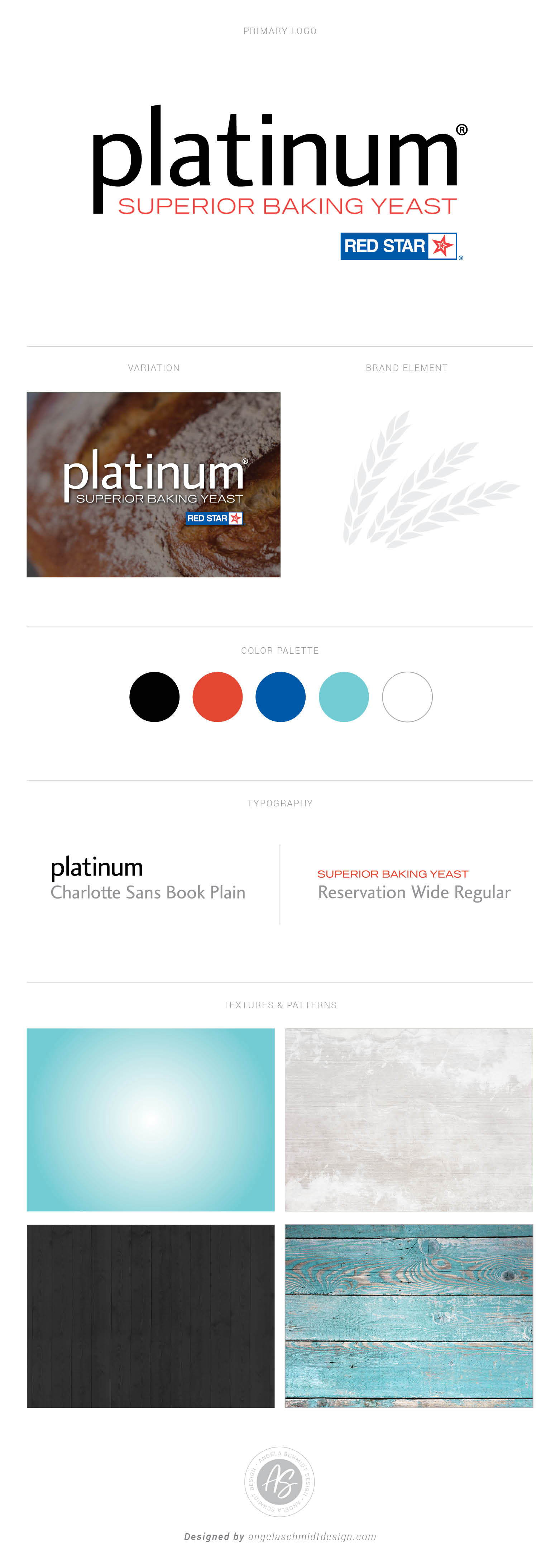
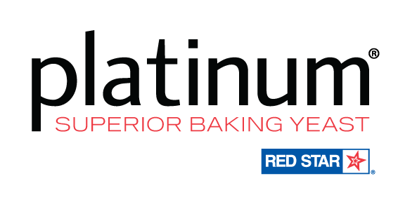
This project was a logo and package design branding refresh. The challenge was to create a more soft, clean, modern style logo by moving away from the harsh all-caps serif font— Platinum Superior Baking Yeast’s old logo design. We decided to explore a new logo design in all lowercase letters during the design process— this one change made a huge difference in the look and feel of the logo. The tagline, Premium Instant Yeast with Dough Enhancers, was removed from the logo design and placed on the package design as a brand element. The red wheat graphic attached to the Red Star logo was also removed and the tagline, Superior Baking Yeast’s font and size was changed to create a cohesive logo design. These changes to the logo helped clean it up and keep it simple!
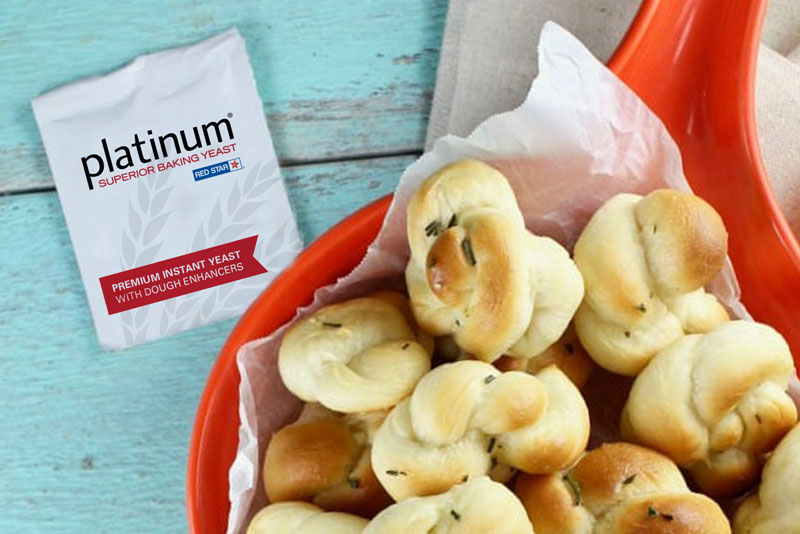
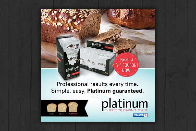
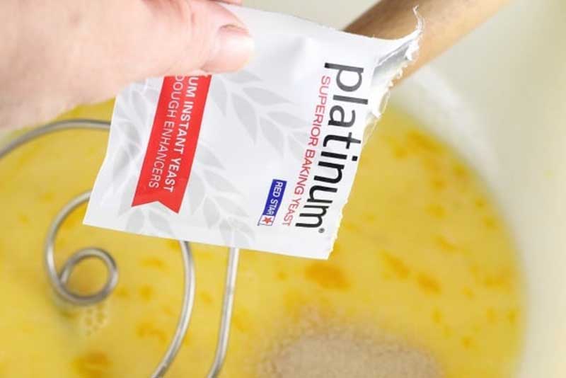
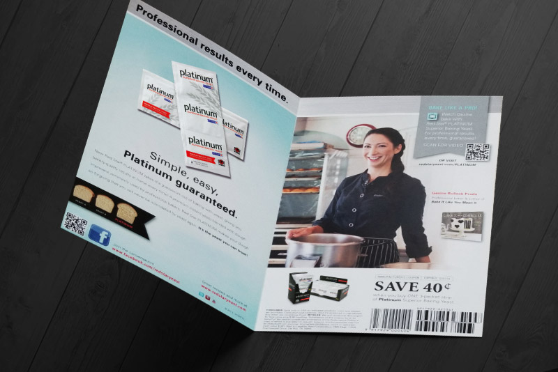
The 3-packet strip re-design simply needed a softer look by changing the color from grey to white and displaying three logos, not just one big one— Platinum Superior Baking Yeast’s old package design. This way when the consumer uses one packet from the 3-count strip, the product logo is still visible on the remaining packets. The wheat graphic in the background was changed to a light grey and became an important element to Platinum’s visual branding. Put the packet strip & carton design altogether and you’ve got yourself an awesome contrasting design.
