Logo Design + Visual Branding + Website Design
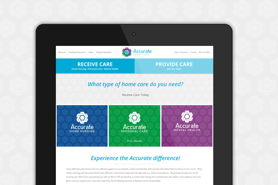
Accurate Home Care needed a brand identity to showcase the corporate company and their three divisions. We ending up creating a logo reflecting their three divisions woven together to make up the company as a whole. Each color in the main corporate logo was used to identify each division; purple for Mental Health, green for Personal Care, and blue for Home Nursing. Their round logo mark made it easy to create colorful seamless patterns for their visual branding.
The Accurate Home Care website needed to speak to two different users: patients and providers. While patients needed to understand the care Accurate provides and what they can expect when they work with Accurate, providers needed to easily find job opportunities at Accurate and learn more about their care philosophy. To make it easy for both types of users to navigate the site, we designed a very large call-to-action menu at the top: RECEIVE CARE and PROVIDE CARE.

